
Build a Website that You Can Be Proud Of

1. Your Website is a Grocery Store with Shelves Full of Links
When you go to the grocery store, you walk down the aisles. Most of the time, you reach only those items within your reach.
You don't spend a lot of time searching high and low.
Imagine, however, that you are the owner of the grocery stores. You notice that the items on the middle shelves are not moving. You would rotate new stock onto these shelves. Because you hope that the new stock sells.
Something similar happens on your website. People browsing will click on links that are the most convenient.
We know that the links with the most clicks are usually above the fold.
"Elements above the fold were seen more than elements below the fold: the 100 pixels just above the fold were viewed 102% more than the 100 pixels just below the fold."
But, just as the stock on your grocery shelves might need restock or rotating, so might your links -- from below the fold to above the fold.
Some of your links to your best content might need to be moved to a more convenient place.
2. How to Tell at a Glance What Links are Most Read
Here is a "heatmap" of our front page from a couple days ago.
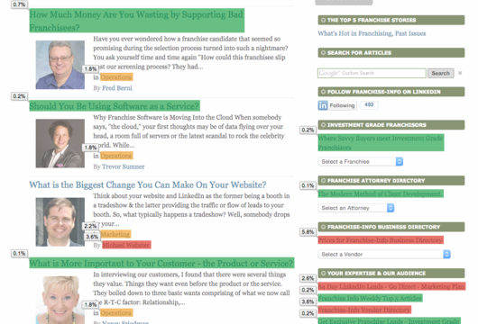
Ok, red is best, and green is worst -- in terms of readers.
At a glance, you can see that on the right hand column some of our best links, those in red, are lower down the page. On our front page, the most read link is "Prices for Franchise-Info Business Directory", but it is past the fold. It would make sense to move it up. (And by the time you see this article, I will have changed it's position.)
There are some links above them are less valuable. Indeed there is one link near the top, our past newsletter archive, that is largely wasting space.
It would like having a whole shelf full of canned spam --which nobody is buying. Why bother? They aren't interested.
So, this heatmap shows us how to rotate or move upwards above the fold -where we hope that they will get even more attention. And to move less worthy links below the fold.
3. And, How Do You Get A Heat Map Like This?
There are a number of heat map technologies out there.
But, this one just uses Google Analytics.
Google Analytics is a powerful program. Incredibly it is free. Google, some years ago, bought out Urchin software. Urchin was selling its analytics solutions for over $10,000 a month. Yet, we get it for free & much more.
But, managing all that analytic power is overwhelming for many people.
Here is a short-cut. Use the page analytics chrome extension.
The Page Analytics Chrome Extension allows you to see how customers interact with your web pages.
The Page Analytics Chrome Extension allows you to see how customers interact with your web pages, including what they click and don't click.
Use these insights to optimize your website layout, improve user experience, and increase conversions.
Sign up for a free Google Analytics account, sign in.
Then on any page in which you have your google analytics tags on, you will be able to create a heat map. Following these two steps.
1. Go to the page you want the heap map for. And turn on the page analytics extension. The orange button should go from "off" to "on".
![]()
2. Next go to the bottom right of the analytics that are now showing and look for these symbols.
![]()
Just click on the red/orange/green color icon. And you will have created your heat map. (If you want the percentages to show, then click on the icon directly to the right, also.) I have found that you must toggle the heatmap on and off as you move to different pages in your website.
Very simple and yet powerful insights.
If you liked this, you should sign up for the LinkedIn Marketing & Advertising Tips from Franchise-Info newsletter.
Or, for more information on what our Franchise-Info Business Directory can do for you, call Joe at 1-443-502-2636 or email Joe direct [email protected]
Leave a comment