
With over 20,000 locations worldwide, it's no wonder you can find a Starbucks location just about anywhere in the world. But did you ever wonder about the history of their name and logo?
Here is a brief history.
1.Origin of the Starbuck's Name
The first Starbucks was opened by three partners in Seattle, Washington on March 30, 1971. The three partners met while students at the University of San Francisco -- English teacher Jerry Baldwin, history teacher Zev Siegl, and writer Gordon Bowker.
This intellectual group of co-founders had an affinity for literary classics and decided to borrow a name from Herman Melville's American classic, Moby-Dick. Originally the company was to be called Pequod, after a whaling ship in the book.
But according to Howard Schultz's book Pour Your Heart Into It, Gordon suggested the name Pequod to his then-creative partner, Terry Heckler, who responded: 'No one's going to drink a cup of Pee-quod!' After much discussion, this name was changed to the chief mate on the Pequod, Starbuck.
2.Who was this Starbuck character?
From Melville's classic Moby-Dick:
Uncommonly conscientious for a seaman, and endued with a deep natural reverence, the wild watery loneliness of his life did therefore strongly incline him to superstition; but to that sort of superstition, which in some organization seems rather to spring, somehow, from intelligence than from ignorance... [H]is far-away domestic memories of his young Cape wife and child, tend[ed] to bend him ... from the original ruggedness of his nature, and open him still further to those latent influences which, in some honest-hearted men, restrain the gush of dare-devil daring, so often evinced by others in the more perilous vicissitudes of the fishery. "I will have no man in my boat," said Starbuck, "who is not afraid of a whale." By this, he seemed to mean, not only that the most reliable and useful courage was that which arises from the fair estimation of the encountered peril, but that an utterly fearless man is a far more dangerous comrade than a coward.
--Moby-Dick, Ch. 26
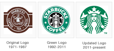
3. Origin of the Starbuck's Logo
Continuing with the Moby-Dick sea-faring theme, the logo originally started as an image of a "twin-tailed mermaid, or siren as she's known in Greek mythology" stated Valerie O'Neil, a Starbucks spokeswoman in 2006. As mythology goes, Sirens lured sailors to shipwreck off the coast of an island in the South Pacific, also called Starbuck Island by some accounts.
It was the intention of the original Starbucks founders to use the mermaid/siren as a symbolic reference to this seductive phenomenon and quality. When applied to coffee, the logo was meant to be that seductive song to lure coffee lovers in from everywhere.
From Howard Schultz's Pour Your Heart Into It, here's a more complete evolution of the Starbucks logo.
"Terry Heckler also poured over old marine books until he came up with a logo based on an old sixteenth-century Norse woodcut: a two-tailed mermaid, or siren, encircled by the store's original name, Starbucks Coffee, Tea, and Spice. That early siren, bare-breasted and Rubenesque, was supposed to be as seductive as coffee itself." [pg. 33]
The original logo version remained in use until 1987 when Howard Schultz raised sufficient capital from local investors to purchase Starbucks from the founders for 3.7 million.
Schultz had previously left Starbucks in 1985 to pursue his vision of a European style espresso cafe when he started the Il Giornale coffee house. The Il Giornale logo was green and reflected a theme of speed with the head of Mercury, the swift messenger god of Roman mythology, at the center.
After the purchase of Starbucks in 1987, Schultz had the Starbucks logo cleaned up a bit and with a more corporate, polished feel. The bare breasts were covered up by the mermaids flowing hair, and the roughn norse-cut look was removed. This was also the point at which the the color scheme was changed from a coffee brown in the original logo to the familiar green established by the Il Giornale logo. As well, the text in the surrounding circular band was changed to simply "Starbucks Coffee".
The logo has continued to evolve over time with the growth and change of Starbuck's. And having such a recognizable brand has also helped consumers spot a Starbucks while driving in traffic or walking on busy city streets. Just the color and semblance of the brand are enough to incite the need for caffeine with many a coffee lover.
Resources:
